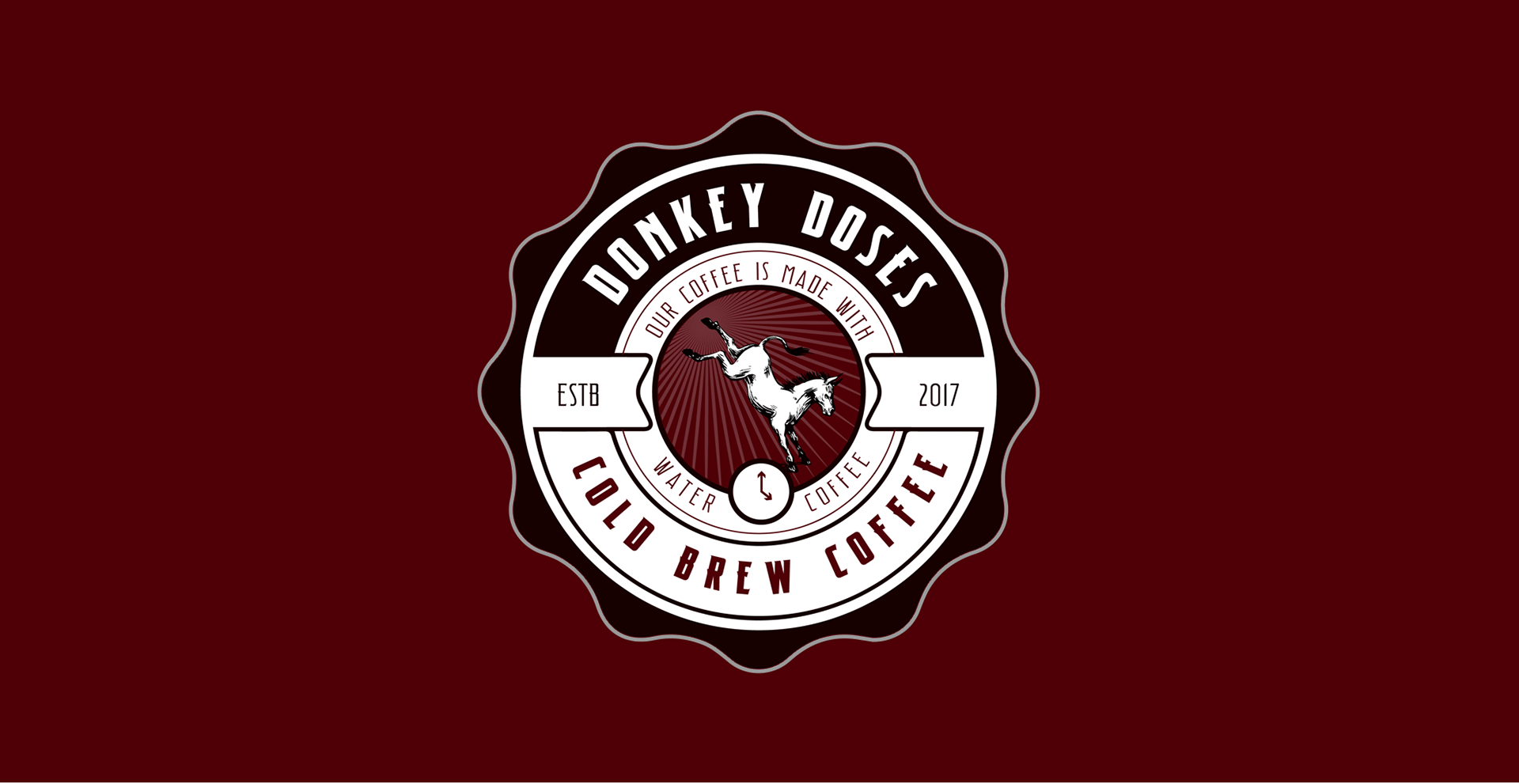
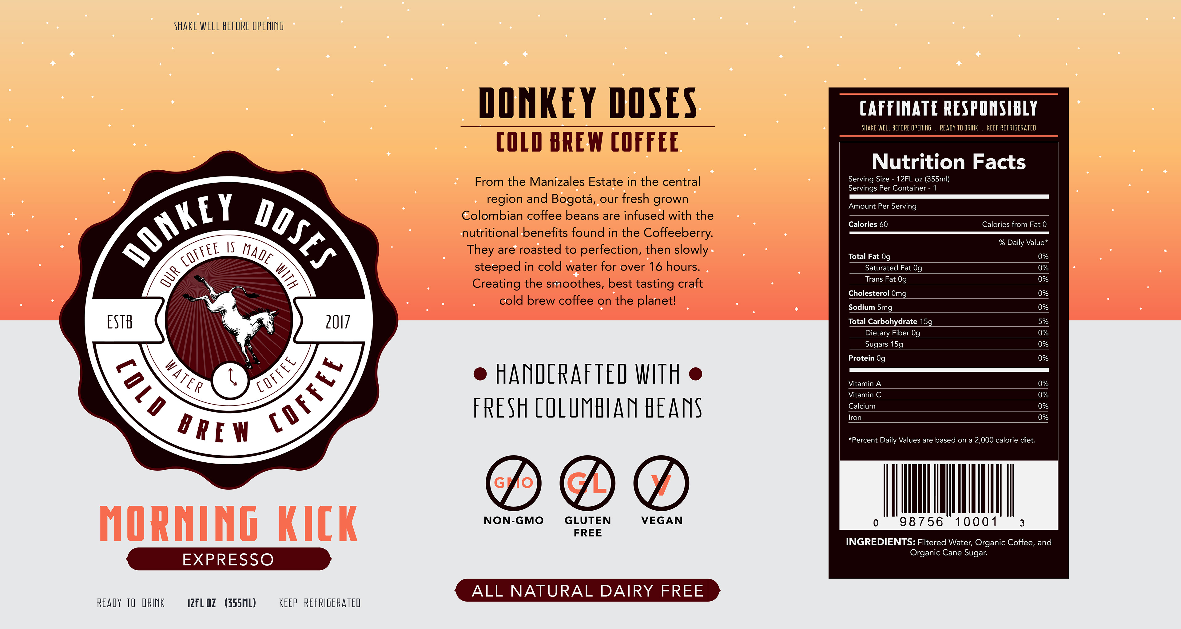
"DONKEY DOSES" PACKAGE DESIGN
_____
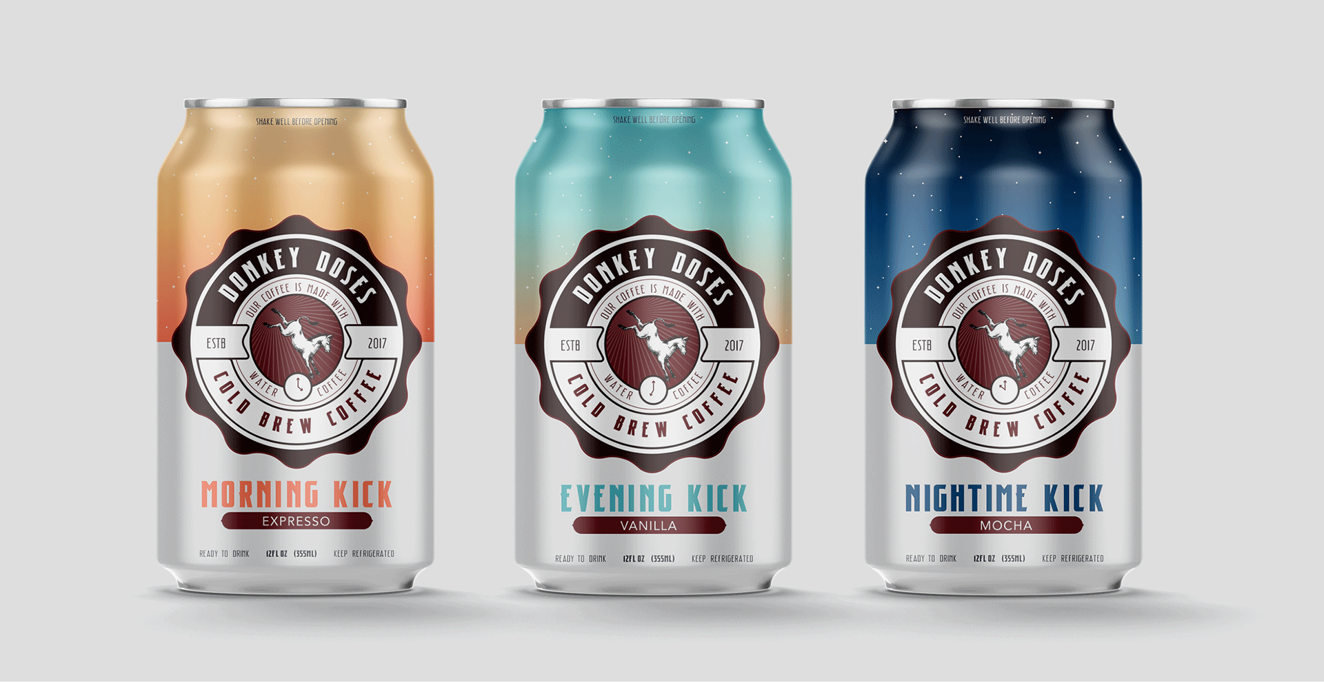
“Donkey Doses” is an illustrated based package design created for the cold brew coffee series. Cold brew is taking the world by storm because it often has a deeper, less acidic and subtler taste, and is more concentrated than conventionally-brewed coffee. Because this product is not a conventional brew, the packaging decision to put it in a can was also less conventional. For each of the different strengths of coffee blend, the packaging followedsuit; morning, evening and nighttime were illustrated by the changing of the top half of the can’s changing of the time of day. The small detail of the clock in the logo double’s as the time (being one of the ingredients in the cold brew) and also the changing of the time in the day.
"PRINGLES ECO" SUSTAINABILITY DESIGN
_____
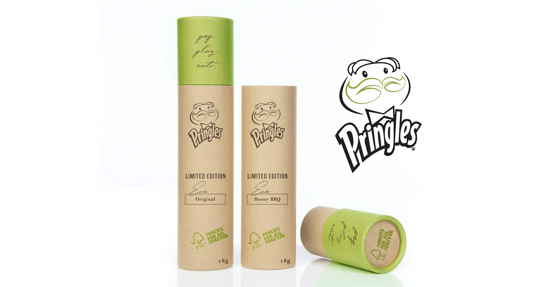
"Pringles ECO” is an eco-friendly based product designed based on the Pringles can. The new packaging for this product includes a 100% Paperboard container which is renewable, biodegradable, recyclable, and compost-able. This still holds Pringles’ widely known tube form, however, this tube has a fitted cap on top, and a free moving paperboard disk in the bottom which pushes upwards, so the consumer can feed the chips up from the bottom instead of trying to fit their hands into the tube or dump the chips onto their hand. The ink for this packing uses a two color black and green vegetable ink, less harmful to the environment to the environment than the petroleum-based inks, and is widely recognized as the environmentally friendly choice. And lastly, the Pringles logo was re-designed for a one-color print and the mustache was illustrated, adding a subtle element by turning it into leaves, to round out the design.
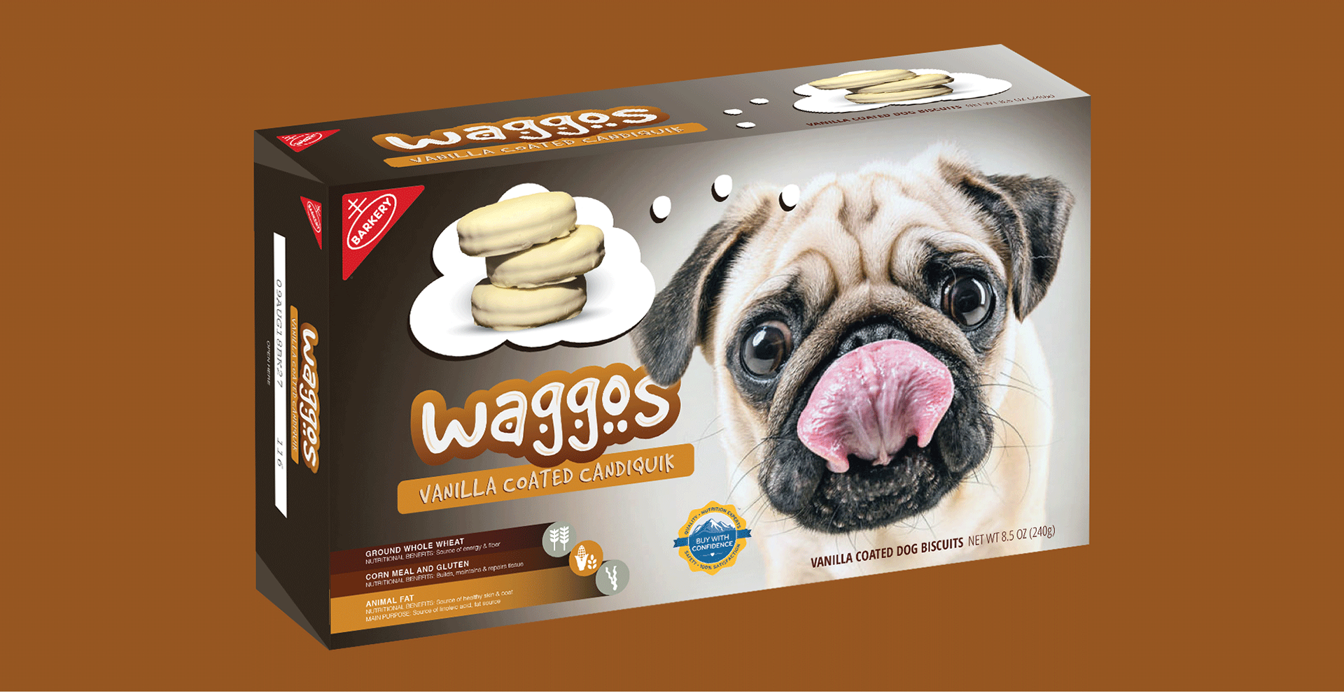
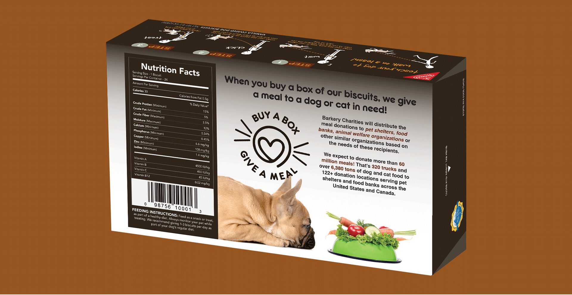
"WAGGOS" DOG TREAT PACKAGE DESIGN
_____
“Waggos” are healthy dog treat, vanilla coated with candiquik. The packaging for these biscuits are boxed for the consumer to easy store in a pantry along side other common grocery items. There is an illustrated step-by-step guide to teach new dog owner’s how to properly train their dog to walk on a leash, using Waggos as their treat for learning. The Waggos logo was created using hand drawn type, separating them from their competitors, and small icons were placed need to the nutritional facts to ensure the consumers were getting the best product for their pets. And lastly each box purchased would allow for a donation to go to pet shelters, food banks and animal welfare organizations, as shown on the back of the box.