SOCIETY NOODLE HOUSE BRANDING PACKAGE
_____
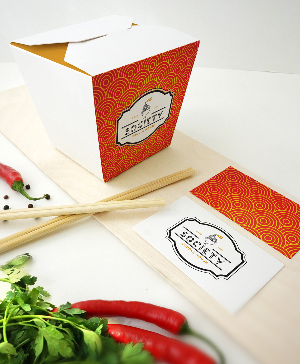
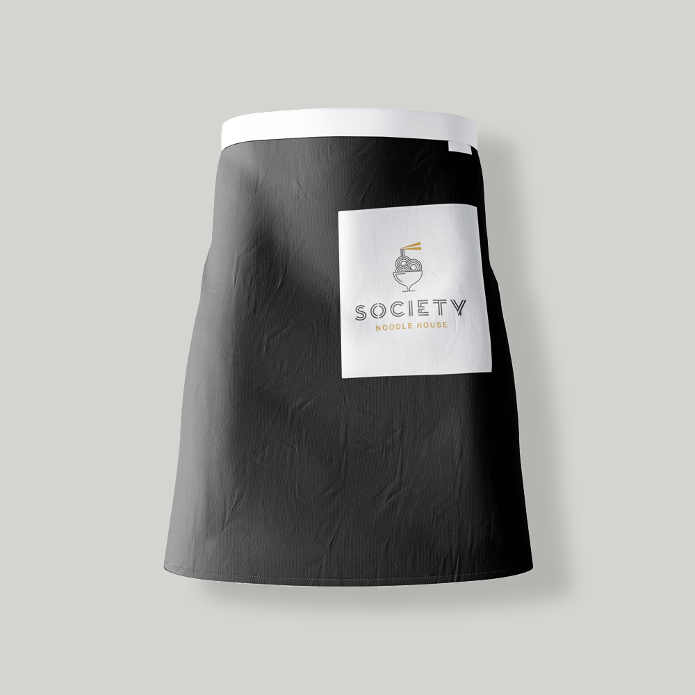
The “Society Noodle House” logo was designed to fit the sophisticated feel of the restaurant. The simplicity of the noodles and the bowl, along with the limited color palette, gives a high class elegant look to the overall design. When researching Chinese culture, the colors red and orange are of a higher importance to the history of Chinese culture. The decision to add a secondary color, orange, in to the brand came from this research, red was introduced into the deliverables to tie in the history of their culture. Customized carryout food containers were created, along with business cards, aprons for the front-line chefs to wear, flyer’s advertising the grand opening, and coupons found on the company’s app were also created to bring new customers in to the restaurant.


